
Story
Today more and more people are sharing pieces of their lives with the rest of the world online and art is no exception. Our team wanted to examine how to better enhance the online art sharing experience for the amateur. So we created a art sharing experience reminiscent of physical gallery spaces.
Overview
Role: UX/UI Designer
Tools: Pen and Paper, Sketch, Invision
Deliverable: Live website
Consumer Insights and Ideation
To address future customer needs we used contextual inquiry methods such as interviews and deep hanging out to gain insight into current user behaviors. As a team we synthesized our data and translated our feedback into customer behaviors and motivations. These were communicated by personas and storyboards.
Personas and Storyboards


Immersion into the types of users our app would target helped us narrow our project focus to the appropriate audience. Storyboards and personas were used to capture the context and pain points of each potential user.
Rapid Prototyping/Wireframes
Sketching the user experience was important during our ideation phase. Quickly done drawings allowed us to communicate abstract concepts and features across the team. Higher fidelity prototypes were used to flesh out ideas and assist in user testing.

.


An exploration of different types of gallery interactions we could potentially use for the homepage. I was particularly intrigued with the idea of exploring pieces three dimensionally- reminiscent of a users experience in a physical gallery space. I made this prototype into a higher fidelity version later on in the process.

This was the most divergent part of our design process. The picture above illustrates different home page our team was deciding between. In addition to the cube interaction we were also interested in a grid and row organization of content. We took these different interactions into testing sessions to see which format users found the most intuitive and enjoyable to navigate.

Piece "pop out" mockup idea. Would expand when the user clicks on a piece from the home gallery.

Profile page mockup. This would be an artist profile page that would include an about section, badges (if they earned any from visit), and an archive of their uploads.
User Testing

A snap shot of critique from different users. Testing allowed us to get feedback on each prototype iteration. We quickly learned which design choices were failing and succeeding. In order to create the final iteration that embodied our design goals we synthesized strengths and weaknesses of each prototype.

Once we settled on the homepage format I created multiple designs of the gallery interaction to explore different visual styles. We then got more user feedback on which style users resonated with the most. Testing made it clear that a white background was more appealing.
Final Design


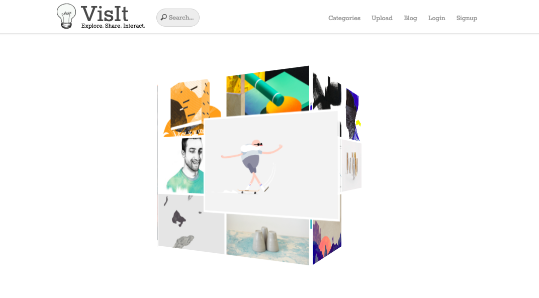

Introducing visit.design (optimized for google chrome). The final product included a interactive cube gallery as the center of attention. Some of the main features inspired by user testing include a rotation that halts upon hover, pop-up windows for navigation, and the ability to upload any web media format in the tiles.